Cartel tipográfico de viaje urbano
Un cartel de viaje minimalista de estilo suizo donde letras gigantes con el nombre de una ciudad enmarcan escenas urbanas ilustradas.
Los modelos económicos no renderizan tipografía de forma fiable; este caso necesita un nivel superior.
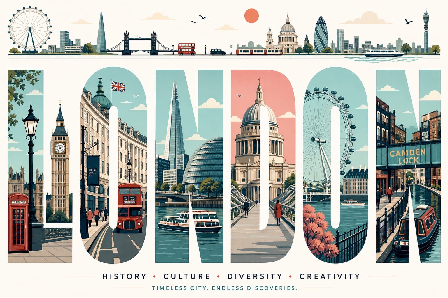
Imagen generada por nosotros con gpt-image-2. Prompt de @iamaiistudio
Prompt
Ultra-high-resolution typography travel poster themed around [CITY]. 16:9 poster ratio.

IMPORTANT: every visible word on the poster must be in English, perfectly spelled, professionally typeset. No distorted letters, no random symbols, no broken text, no AI gibberish.

CORE COMPOSITION:
Place the giant English word "[CITY]" front and center. Each letter is a tall, bold, elongated sans-serif form, and each one frames a different illustrated scene from the city, like a row of gallery windows. Spread landmarks, streets, transport, nature, culture, and architecture across the letters so the scenes flow from one letter into the next as a single connected urban panorama.

TOP HORIZONTAL STRIP:
Across the top of the poster, a thin panoramic band: city skyline silhouettes, cars, trams or trains, boats where it fits, birds, clouds, sun. Keep it minimalist, elegant, rhythmically balanced.

STYLE: mid-century modern editorial poster, Swiss graphic design, minimal vector illustration, architectural infographic feel, travel typography poster, flat geometric illustration, ultra-clean composition, premium magazine design, screen-print poster vibe, retro-futuristic travel branding.

ILLUSTRATION:
Flat vector shapes only. No realism, no gradients, no noise. Clean geometric shadows, simplified architectural forms, a mix of map-like top-down with side-view cityscape. Subtle line-art details, crisp vector edges, strong negative space, harmonious rhythm between the letters.

TYPOGRAPHY:
Giant bold sans-serif, letters fill most of the canvas height. Pixel-perfect alignment. Each letter acts as its own framed illustration panel. Soft rounded corners where it suits. Editorial spacing. Print-ready and geometrically clean.

COLOR PALETTE:
Pull a cohesive palette inspired by [CITY]:
coastal city -> aqua, sand, coral, muted teal
desert city -> terracotta, beige, warm cream
cyber city -> mint, navy, steel blue
historic European city -> dusty rose, olive green, parchment
Muted pastels, soft vintage travel-poster colors, low saturation. Max 4 to 6 colors.

CONTENT:
Include iconic landmarks, famous streets and transport, local urban patterns, nearby nature, skyline silhouettes, bridges/rivers/coastline if relevant, culturally symbolic architecture, recognizable local atmosphere.

COMPOSITION:
Centered typography on a white or soft ivory background. Lots of breathing room. The top panoramic strip balances the heavy typography below. Asymmetrical but visually balanced. Each letter shows its own scene depth and perspective. Museum-quality poster hierarchy.

MOOD: premium, intellectual, calm, design-forward, travel-editorial, stylish enough for a museum gift-shop wall.

QUALITY: 8K ultra-detailed, print-ready, razor-sharp vector edges, flawless typography, zero distorted text, zero random characters, zero spelling errors, zero AI artifacts.
Quedan 3 huecos sin rellenar. Si copias así, el generador dibujará los corchetes tal cual dentro de la imagen.
Variables editables
Cambia cualquier valor y el prompt se reescribe arriba. Copia el resultado ya listo.
El nombre de la ciudad que aparece como la palabra tipográfica gigante y tema central del cartel.
Genera la imagen aquí
Con tu propia clave de OpenAI. Gratis para nosotros, lo que gastes es tuyo.
Se guarda solo en este navegador y va directa a la API de OpenAI: no pasa por ningún servidor nuestro, porque no hay ninguno en medio. Puedes comprobarlo en la pestaña de red del inspector.
Rellena las variables que quedan antes de generar: si no, el modelo dibujará los corchetes.