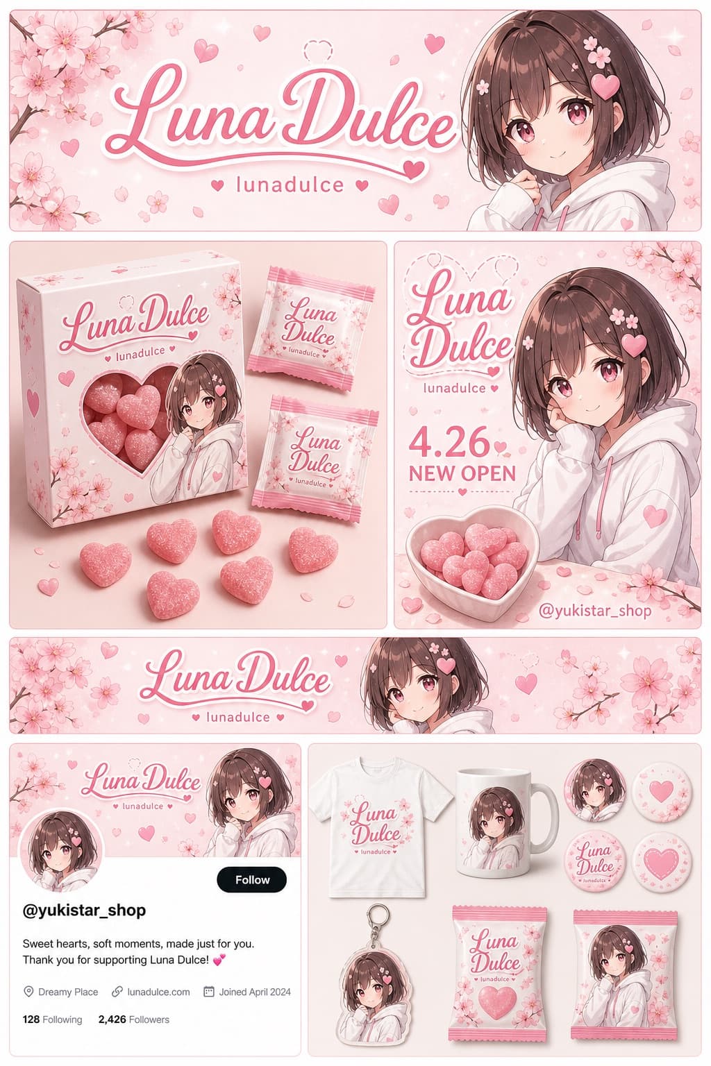
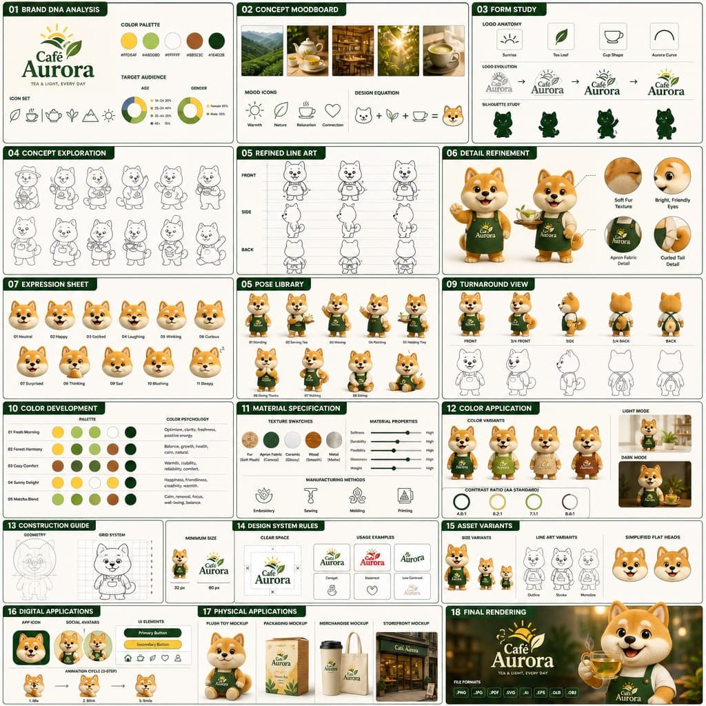
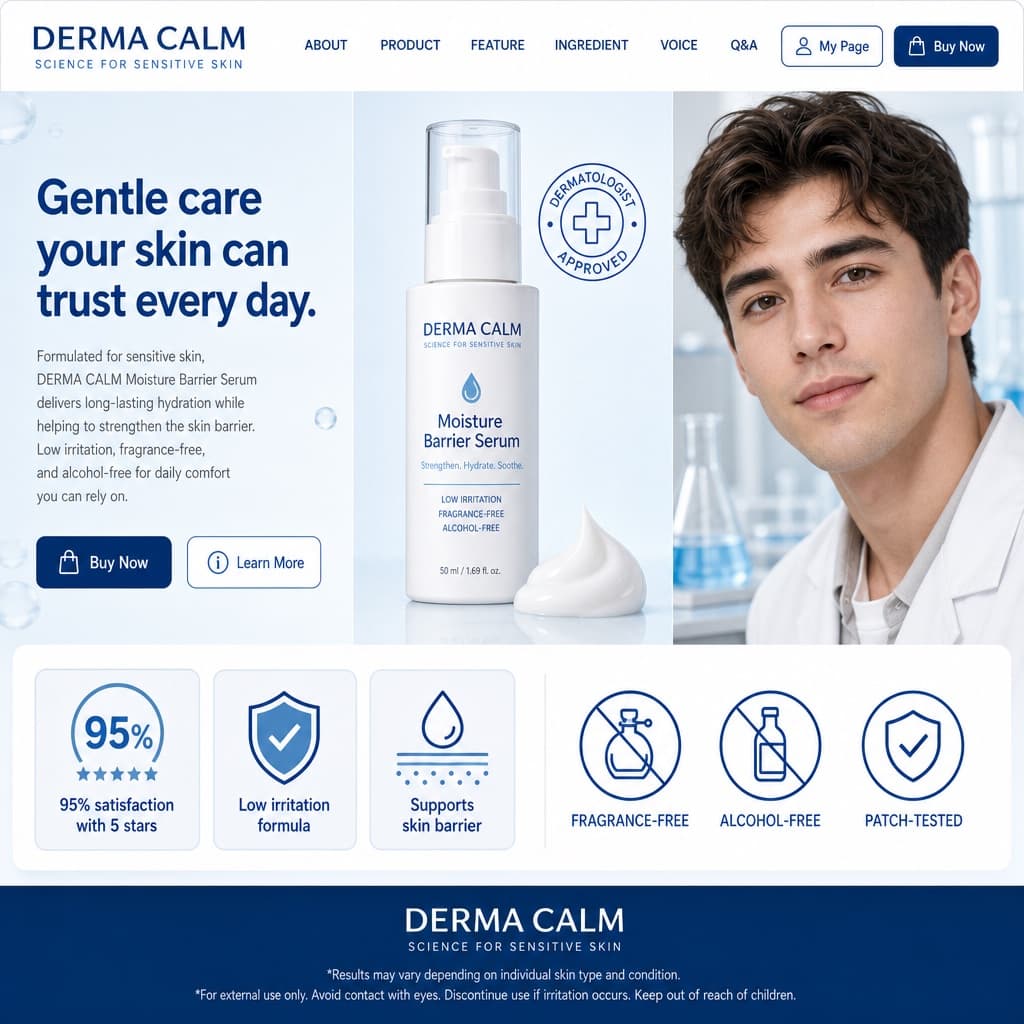
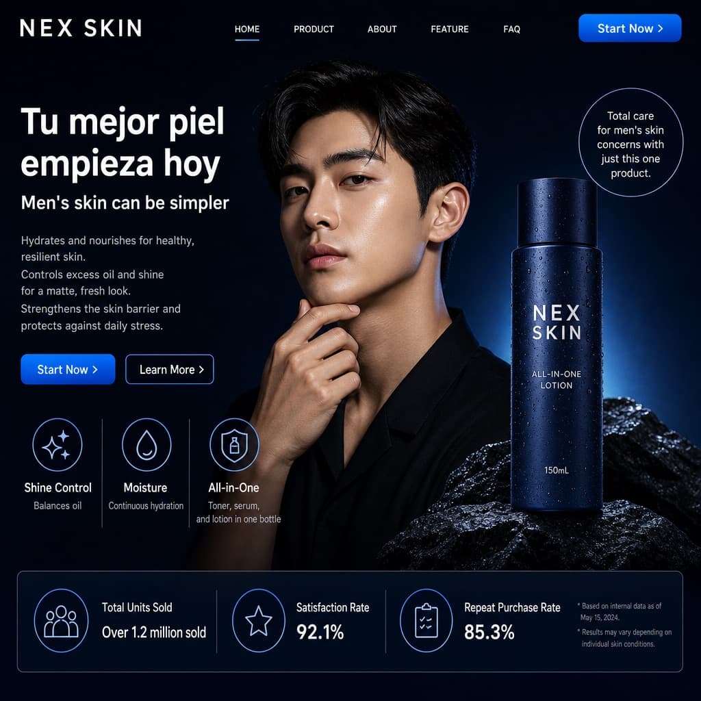
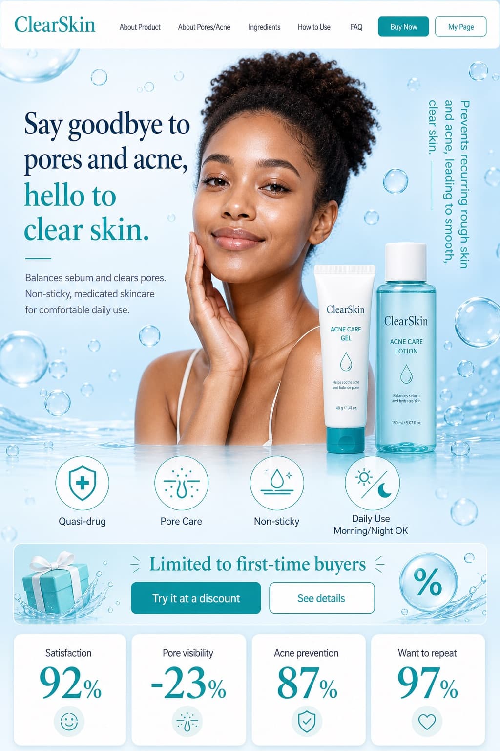
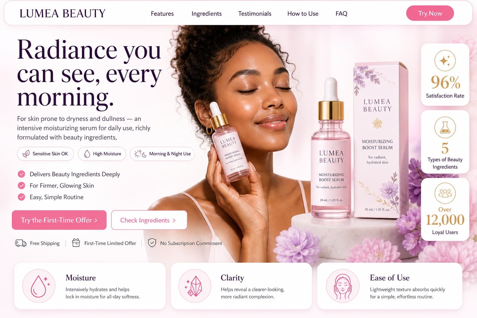
Explosive Brand Identity Moodboard
A densely layered, asymmetrical editorial collage that visually explodes an entire brand identity system into one bold, shareable frame.
Budget models do not render typography reliably; this case needs a higher tier.
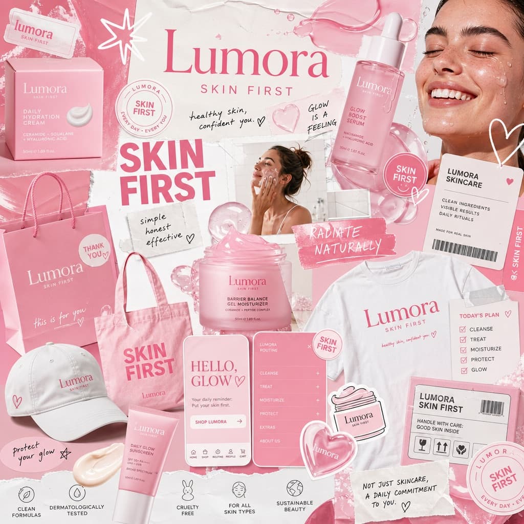
Image generated by us with gpt-image-2.
Prompt
Act as a world-class creative director, brand strategist, and editorial art director with deep expertise in high-impact campaign systems for global brands.

Create a bold, visually explosive, densely layered editorial moodboard collage that captures an entire brand identity system in a single frame. The result should feel raw, expressive, and intentionally chaotic, like a brand world exploding on the canvas.

BRAND INPUTS:

BRAND NAME: [BRAND_NAME]
PRODUCT TYPE: [PRODUCT_TYPE]
PRIMARY COLOR: [PRIMARY_COLOR]
SECONDARY COLOR: [SECONDARY_COLOR]
ACCENT: translucent gloss
PERSONALITY: fresh, minimal, youthful, clean
SLOGAN: [SLOGAN]

COMPOSITION:

Build a dense, overlapping collage that mixes:

- real product photography and lifestyle imagery
- packaging elements: bags, boxes, labels, stickers
- typography snippets and brand phrases
- hand-drawn doodles and illustrated graphics
- icons, symbols, and badge / stamp elements
- abstract blobs, squiggles, and starbursts
- UI-style cards, menus, and label panels
- editorial cutouts layered with depth

The layout should feel:

- asymmetrical, not grid-based
- intentionally messy but visually balanced
- like a mood board crossed with a high-end campaign shoot
- expressive, youthful, and saturated with brand identity

VISUAL EXECUTION:

Include elements such as:

- product packaging mockups (bags, boxes, tags)
- a lifestyle shot of someone interacting with the brand
- bold headline typography blocks
- illustrated objects interacting with real photography
- merch items: t-shirt, tote bag, cap
- playful graphic overlays and brand-consistent texture

COLOR RULES:

- strictly adhere to the brand palette
- dominant use of [PRIMARY_COLOR] throughout
- [SECONDARY_COLOR] for contrast and layering
- avoid introducing off-brand colors
- high contrast and visually commanding

TYPOGRAPHY:

- mix of editorial serif and clean sans-serif
- bold headlines paired with small UI-style text
- brand name and slogan integrated naturally into the layout

FINAL FEEL:

This must look like a creative direction board for a global campaign. Not a clean layout, not a grid, not minimal. It must feel alive, layered, and brand-heavy, a visual identity snapshot that is highly shareable and scroll-stopping.
7 placeholders still empty. Copied as is, the generator will draw the brackets literally inside the image.
Editable variables
Change any value and the prompt rewrites above. Copy the finished result.
Placeholder for the fictional or generic brand name featured across the collage.
Category of product the brand sells, defining the visual references used in the collage.
Dominant brand color used throughout the composition for consistency.
Secondary brand color used for contrast and layering against the primary tone.
Short brand tagline integrated naturally into the typography of the layout.
Generate the image here
With your own OpenAI key. Free for us, and what you spend is yours.
Kept in this browser only and sent straight to OpenAI's API: it never passes through a server of ours, because there is no server of ours in between. Check it yourself in the network tab.
Fill in the remaining variables before generating, or the model will draw the brackets.